Timeline
Jun 2023 - Current
My Role
Full-Stack Designer
Company
Nexsoft
Tools
Figma
Zeroheight
Lottie Lab
Background
Nexsoft is a specialized software house with a core focus on developing and implementing a comprehensive end to end distribution Management system (DMS).
My Deliverables
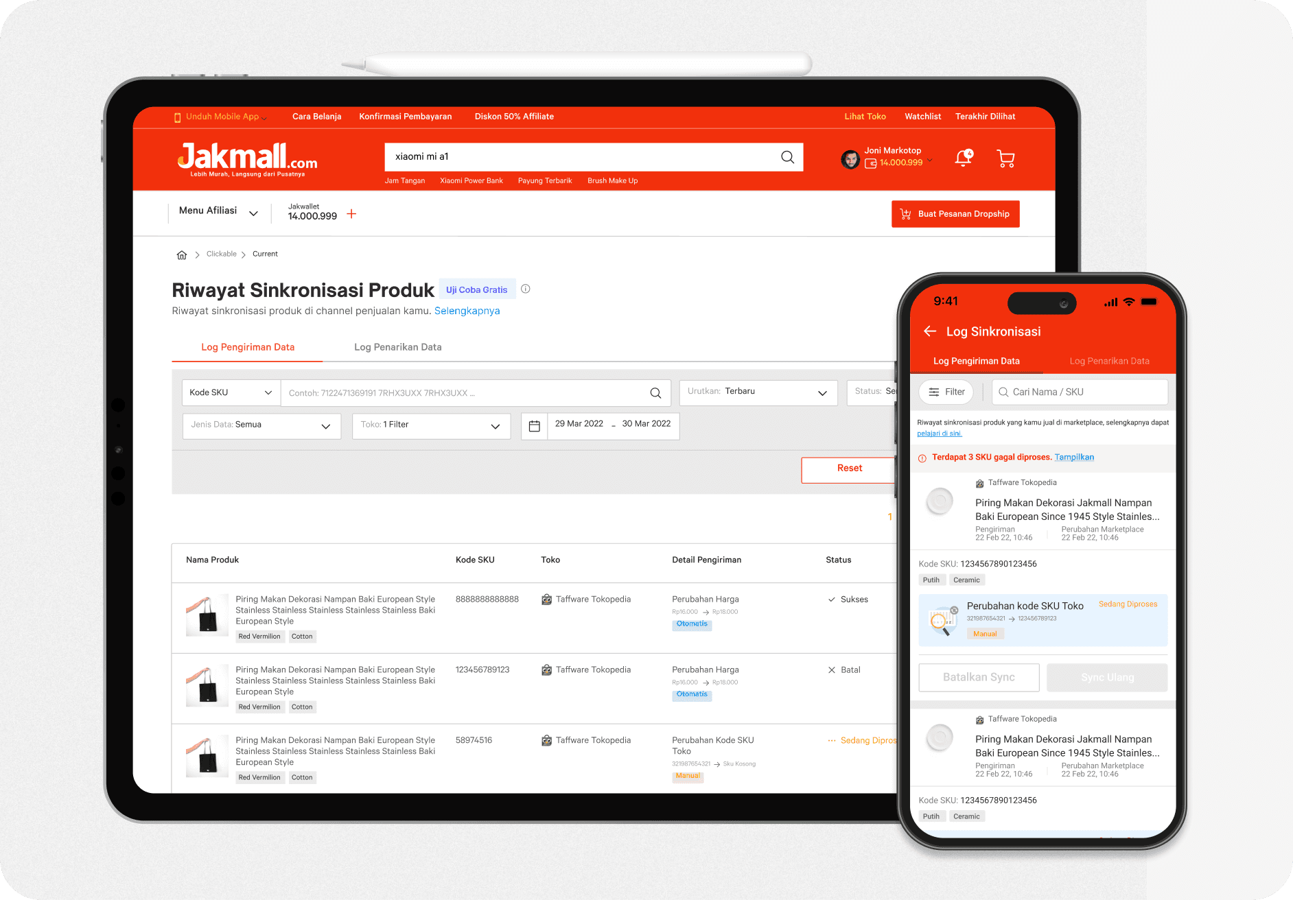
Audit & Analysis: Performed a thorough UI evaluation across various products to pinpoint design discrepancies, usability challenges, and opportunities for standardization.
Foundation Creation: Established essential design tokens including color scheme, typography, spacing, and elevation. Guaranteed that accessibility and responsiveness were integrated into the core.
Component Library Creation: Crafted and documented a reusable component library in partnership with developers, maintaining consistency between Figma and code applications.
Design-Engineering Collaboration: Collaborated with frontend engineers to set up naming conventions, usage rules, and versioning standards. Coordinated frequent transitions and design quality assurance procedures.
Documentation & Governance: Developed concise, accessible documentation and usage protocols to assist in onboarding product teams and sustaining adoption.
Advocacy & Enablement: Promoted the implementation of the design system among teams via workshops, training sessions, and continuous assistance. Collected input to refine and expand the system successfully.
Scalability Planning: Developed the system to accommodate future product expansion by incorporating modularity, theming options, and support for multiple brands

The Problem
The design system is still in the premature phase
We looked into how the team was using the design system and identified the areas that we could immediately improve.
The team needed a robust design system
As the project became more complex and the team grew larger, the Iris ground software team started to face new challenges.

Inconsistency in Design
With multiple product teams working independently, there was a lack of consistency in design elements.
Outcomes

Measuring Success
As the software became more complex and the team grew larger, the Iris ground software team started to face new challenges.


Reestablishing the Process
We rearrange the process with multiple product teams working independently, there was a lack of consistency in design elements, resulting in fragmented user experiences across different applications.

Laying The foundations
Defining Principles and Guidelines: With a clear understanding of user needs and organizational objectives, We established core design principles and guidelines to govern the design system's development. These principles served as the foundation for decision-making, providing a framework for consistency, usability, accessibility, and brand identity. By articulating clear guidelines for typography, color, spacing, imagery, interaction patterns, and other design elements, we ensured coherence and alignment across products.
Bridging the Gap between Design & Development using Design Token
To Streamline the workflow between design and development, we use the token system that act as a variable that stores styles such as colors, typography, and measurements. Whenever the design team wants to change a style, they can change the color token without the need of sounding the engineers that there are changes in the color. Both designers and engineers can be confident that the same color will be used in both places.
To guarantee unchangeable conformity with code, design tokens are developed in close coordination with engineering. In order to accomplish this, we used the Tokens Studio Figma plugin, which syncs to GitHub and gives engineers a common language for design at all system levels.


Defining The Nomenclature
We try to define the format of the token that will be use across the system. A token name's components are divided into Foundation, Usage, state, prominence and interaction.

Color Token Structure

System Within The Systems
A design system is composed of numerous subsystems that cooperate with one another. For instance, the larger modules that make up a view are impacted by the component hierarchy, and the line height of a label when combined with padding affects the size of a component. Understanding how a single change made in one location can have an impact on the system as a whole is crucial. This is one of the reasons why design systems are a constantly changing product that need excellent systems thinking, taste, and a very high level of attention to detail.
Component Architecture
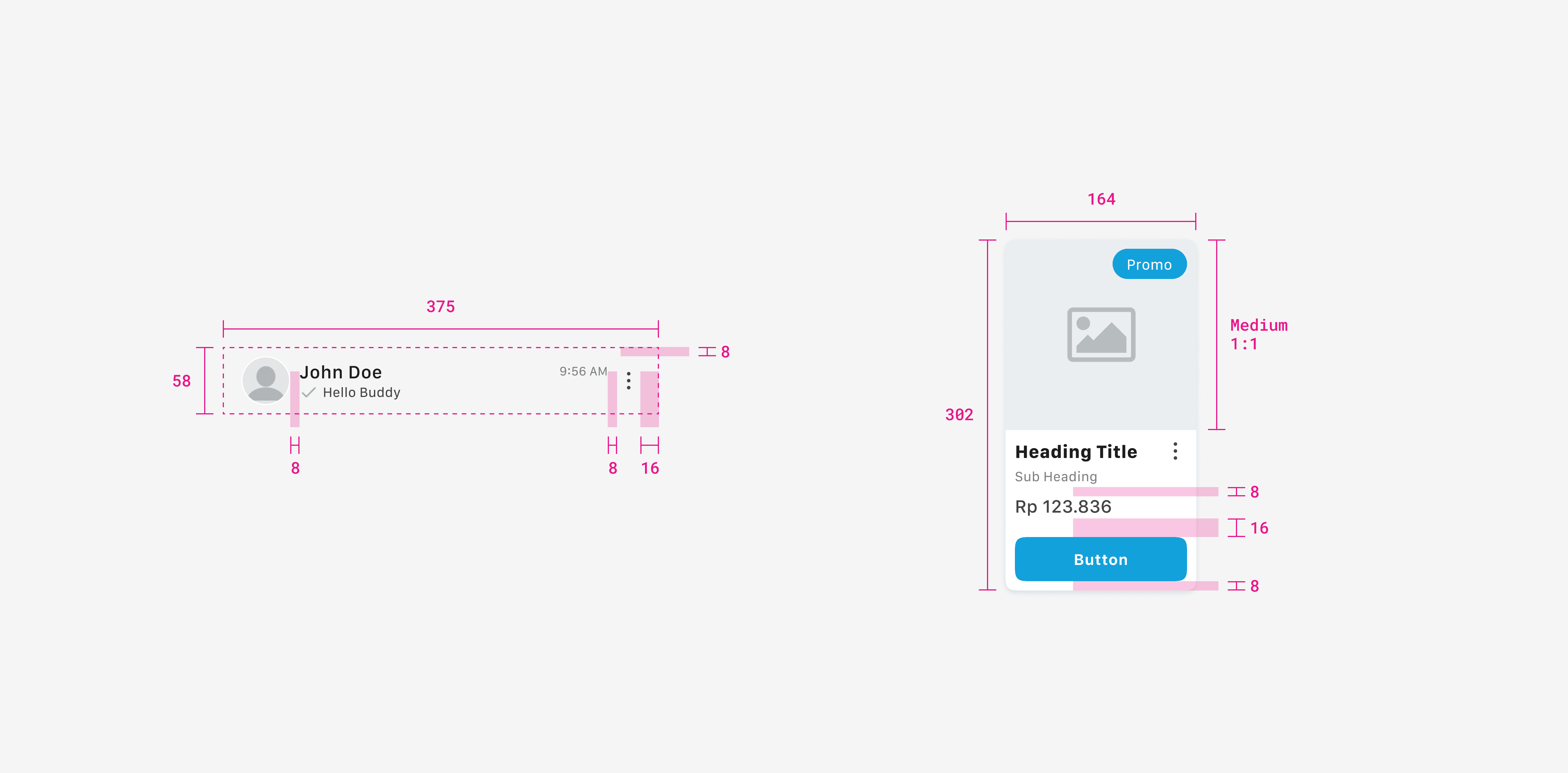
Starting at the atomic level, we treated every part of this system as a component. Rather of attempting to construct every size and variant for more complicated components made up of numerous other atomic components, this enabled for the handling of component sizes and variants at this level. When it came time to design in Figma and construct in code, this produced both uniformity and flexibility.

Interchangable Container
Improve uniformity throughout project by utilizing interchangable components. This parent container components that can dynamically swap or change its child components based on the context or purposes. Consider this components as picture frames in agile approach—possibly varied styles on the outside, changeable material on the inside.
This approach brings significant advantages, such as code reusability, easier maintenance, and dynamic updates without breaking the overall structure.

Defining Variants & Properties
For this system, we approached everything as a component, starting at the atomic level. This allowed for handling component sizes and variants at this level instead of trying to build every size and variant for more complex components composed of many other atomic components. Then we make some of the atom components a boolean properties to make it easy for designers to use. and This resulted in both consistency and flexibility when needing to design in Figma and build in code.

Documentation
View Documentation

We use Zero Height to document a design system to empowers the tech team by keeping everything from design principles, tokens, components, illustrations organized, accessible, and consistent. By streamlining workflows and keeping the entire team aligned on design and development standards, the design system becomes a living document that evolves alongside the product.
A design system or product is only as good as its documentation. For design systems, this entails written documentation in Figma that provides users with a location to learn whatever they require about a design system property, token, or component. It also refers to robust code documentation, which should ideally be written directly into each file and appear immediately on a website dedicated to design systems documentation.

Key Takeaways
Cross Functional Input is Crucial
Involve developers, product managers, QA, and even customer support in the design system process. Their perspectives reveal edge cases, gaps, and opportunities for improvement.
Kevin Pranata
Lukman Arif
Abraham Dixon
Aldi Adi Saputro
Adi Kusuma
Tubagus Tamma

© 2025 Kevin Pranata. All rights reserved.