Timeline
Jan - Feb 2025
My Role
Full-Stack Designer
Company
Nexsoft
Tools
Figma
Figjam
Redmine
Team
Kevin Pranata
Aldi Adi S
Fira Bella
Kenneth D
What is Grotrack?
GroTrack is one of the products within GroUp (B2B Super App), intended designed for Resellers and distributors to monitor their orders, check delivery statuses, and manage credit limits.
The GroUp application is a digital platform designed to make it easier for shop owners to order consumer products without having to wait for a visit from a distributor's sales staff.
My Contribution
I responsible for the full end- to end design process of this project.
User Research
Design Ideation, excecution (Protoyping) and handover
Usability Testing
Insights
Problem #1
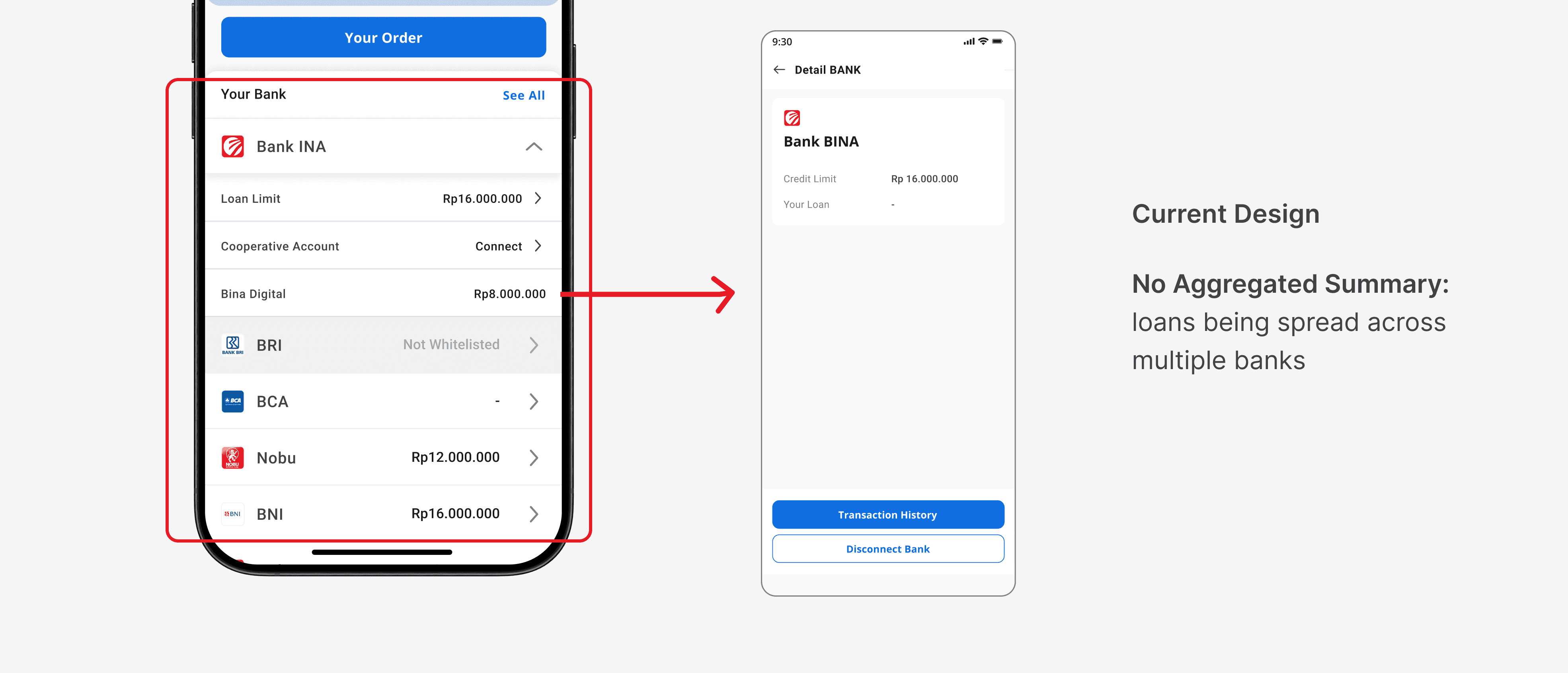
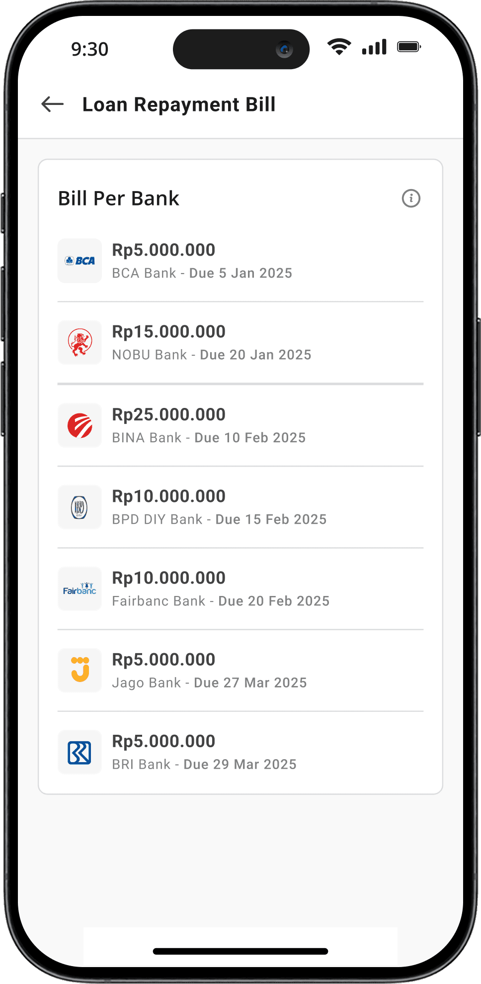
Distributors using GroTrack often manage credit facilities across multiple banks, each with its own loan limit, utilization, and locked amounts. However, the existing system lacked a centralized and transparent view of their overall credit standing
Without an aggregated summary, users struggled to:
Monitor how their loan usage was distributed and utilized per institution.
Identify which credit lines were nearing their limits or locked without switching between different screens or systems.
Problem #2
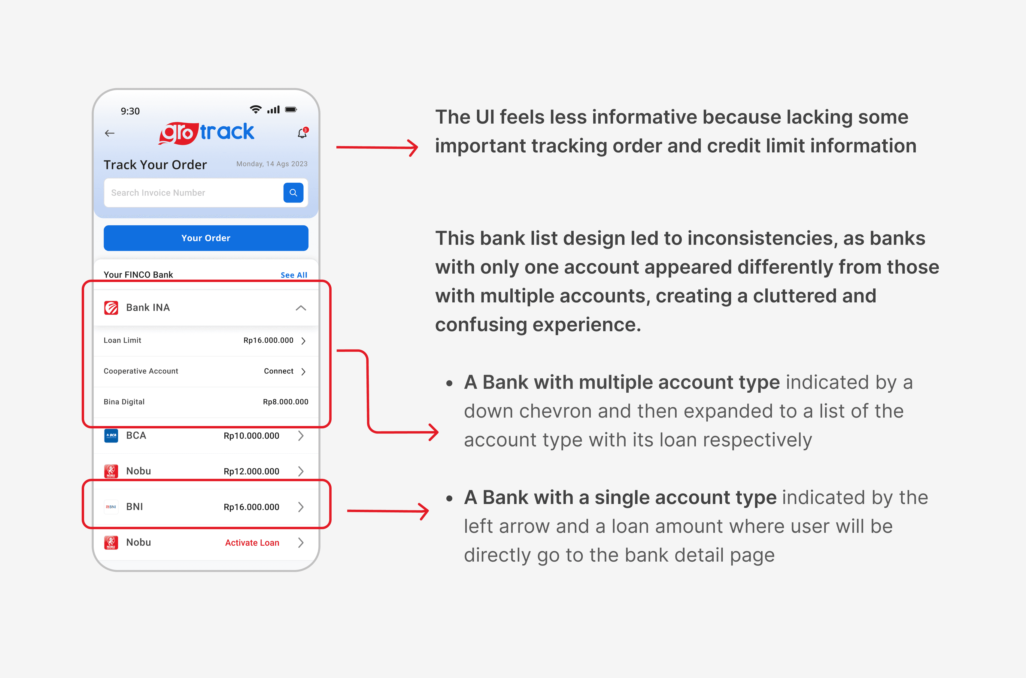
Difficulty in navigating and understanding Bank List
Problem #3
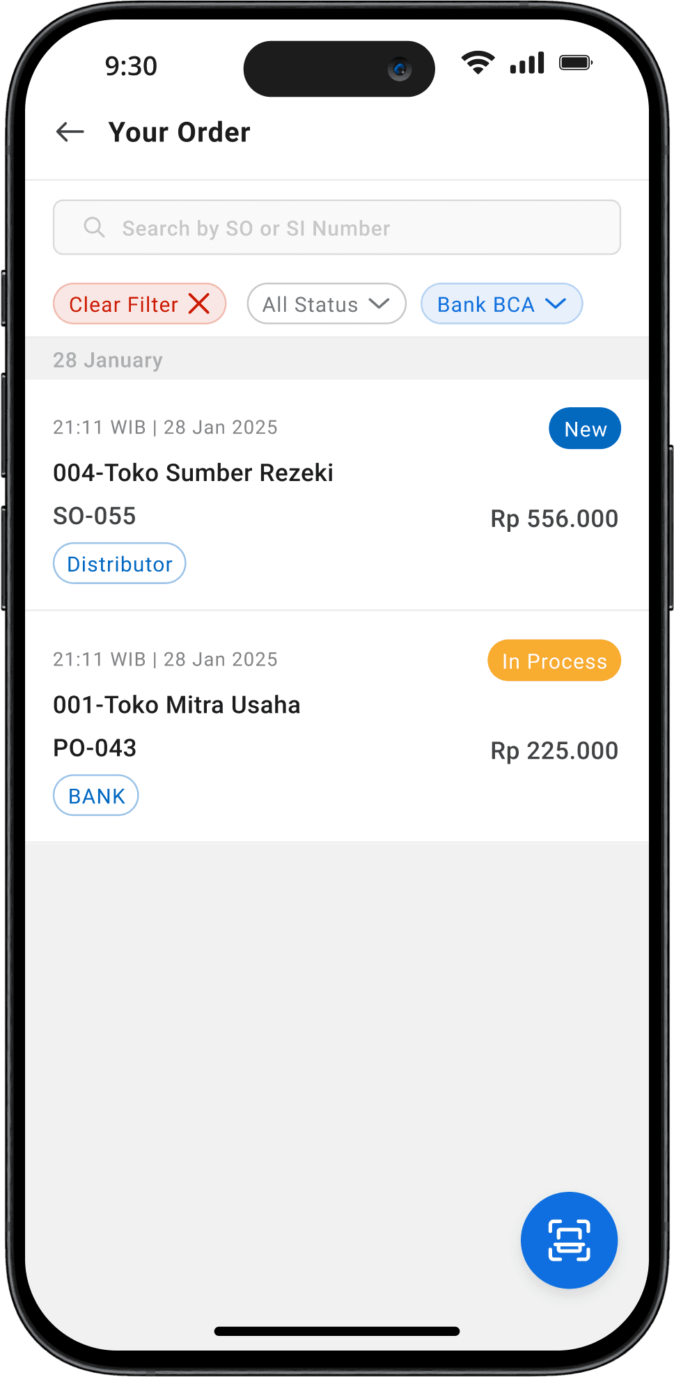
Distributors frequently complained that they needed to “just see where my latest order is” without navigating away from the homepage.
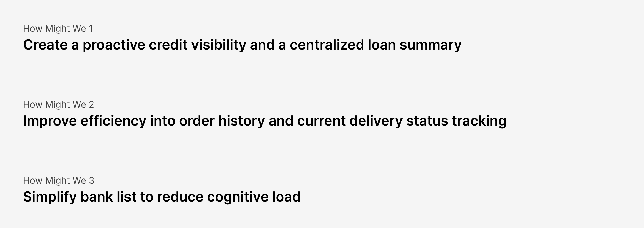
Solution
This redesign aimed to enhance usability, reduce friction in tracking credit, and introduce a Credit Tracker Dashboard to provide distributors with better financial control.
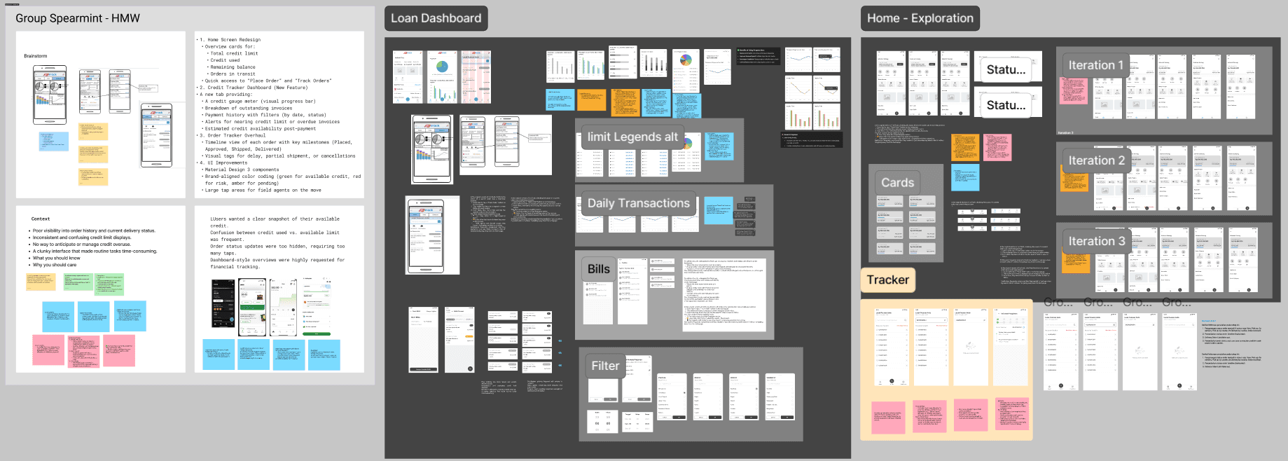
Ideation
I've held a collaborative session with business analyst and product manager gather further details on this project and set expectations
Focus Areas
01
Home Page
02
Navigation
03
Loan Dashboard

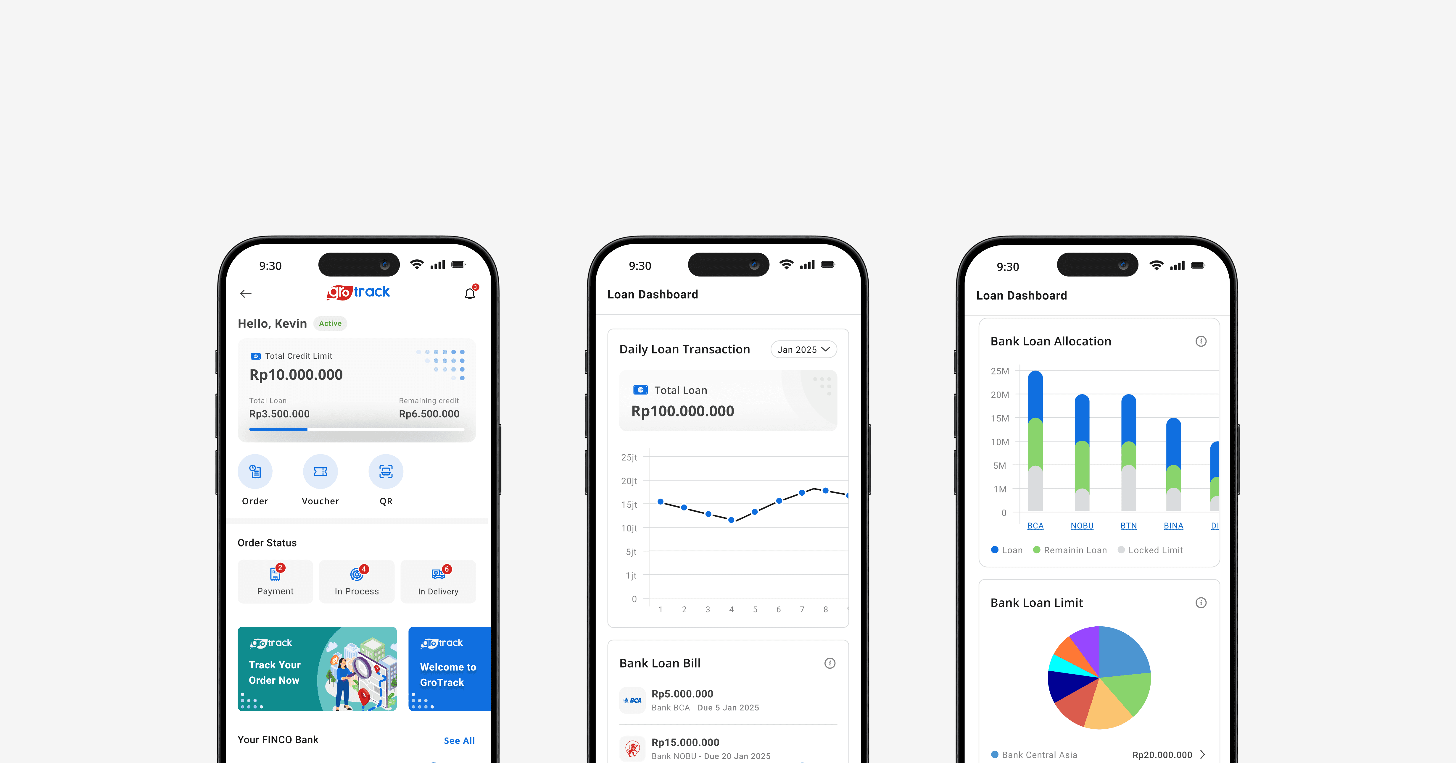
I fully redesigned the homepage by adding 3 main aspects:
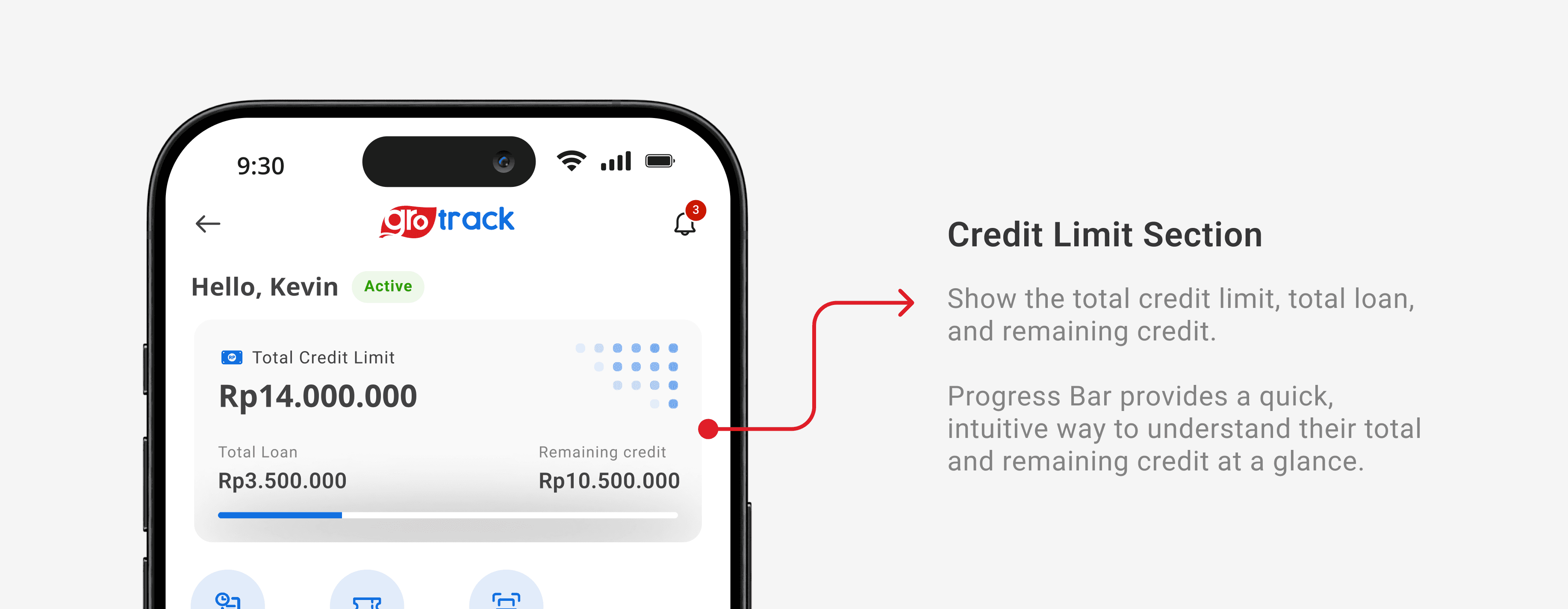
Credit Limit Section Ensure users can quickly access critical loan, credit, and order tracking insights at a glance, reducing the need for excessive navigation.
To enhance user awareness of ongoing transactions, I create a status order tracker directly on the home page which provides a real-time updates on order progress.
To Accommodates tracker and dashboard as a main feature and provides more seamless navigation, i add a navigation bar. I also place the tracker in the center and highlight it to enhance user awareness
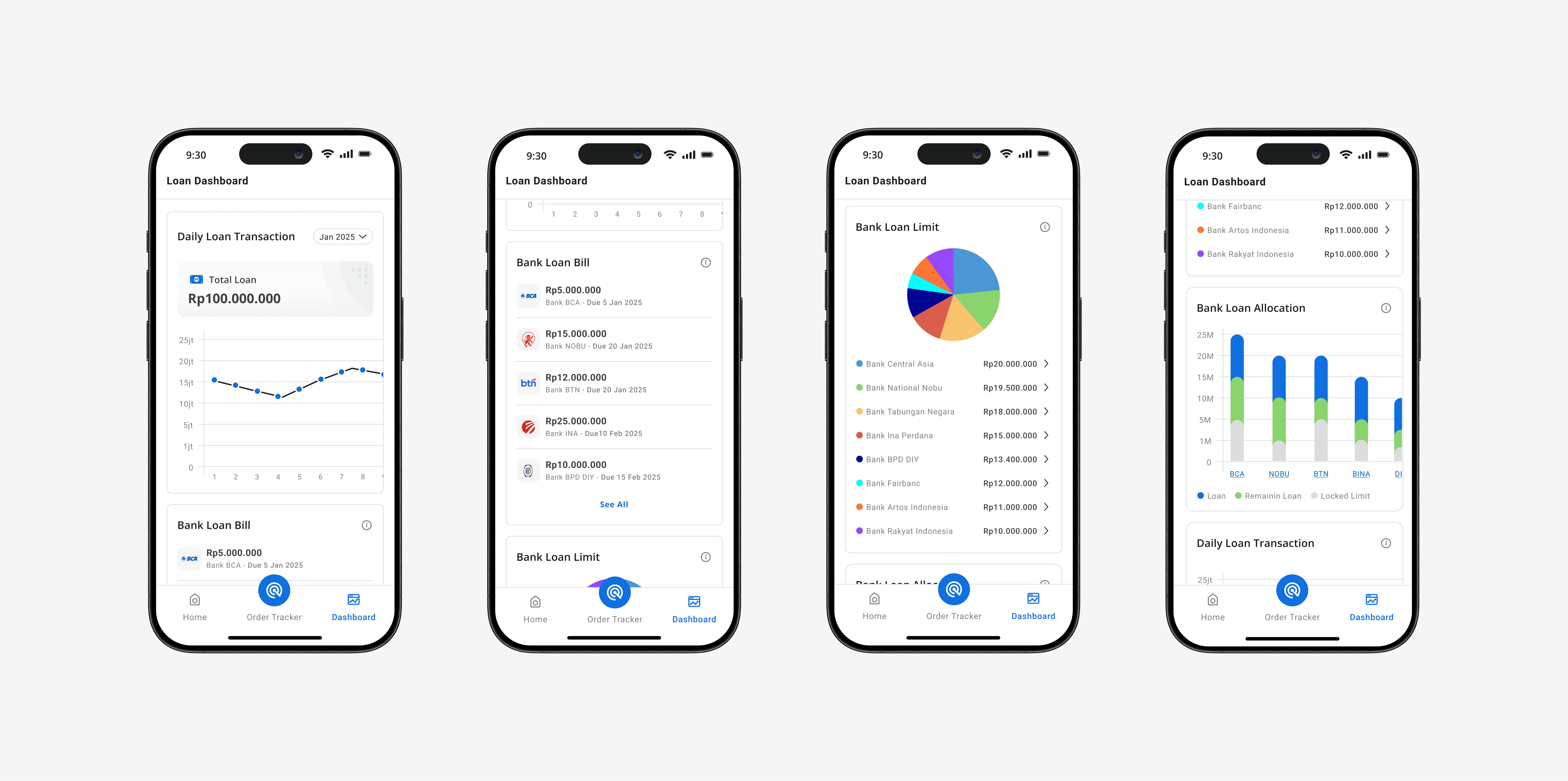
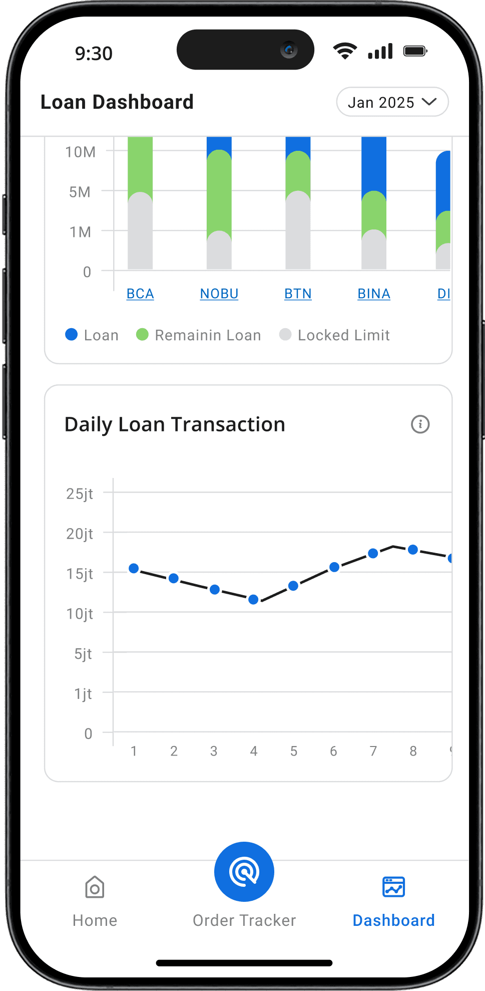
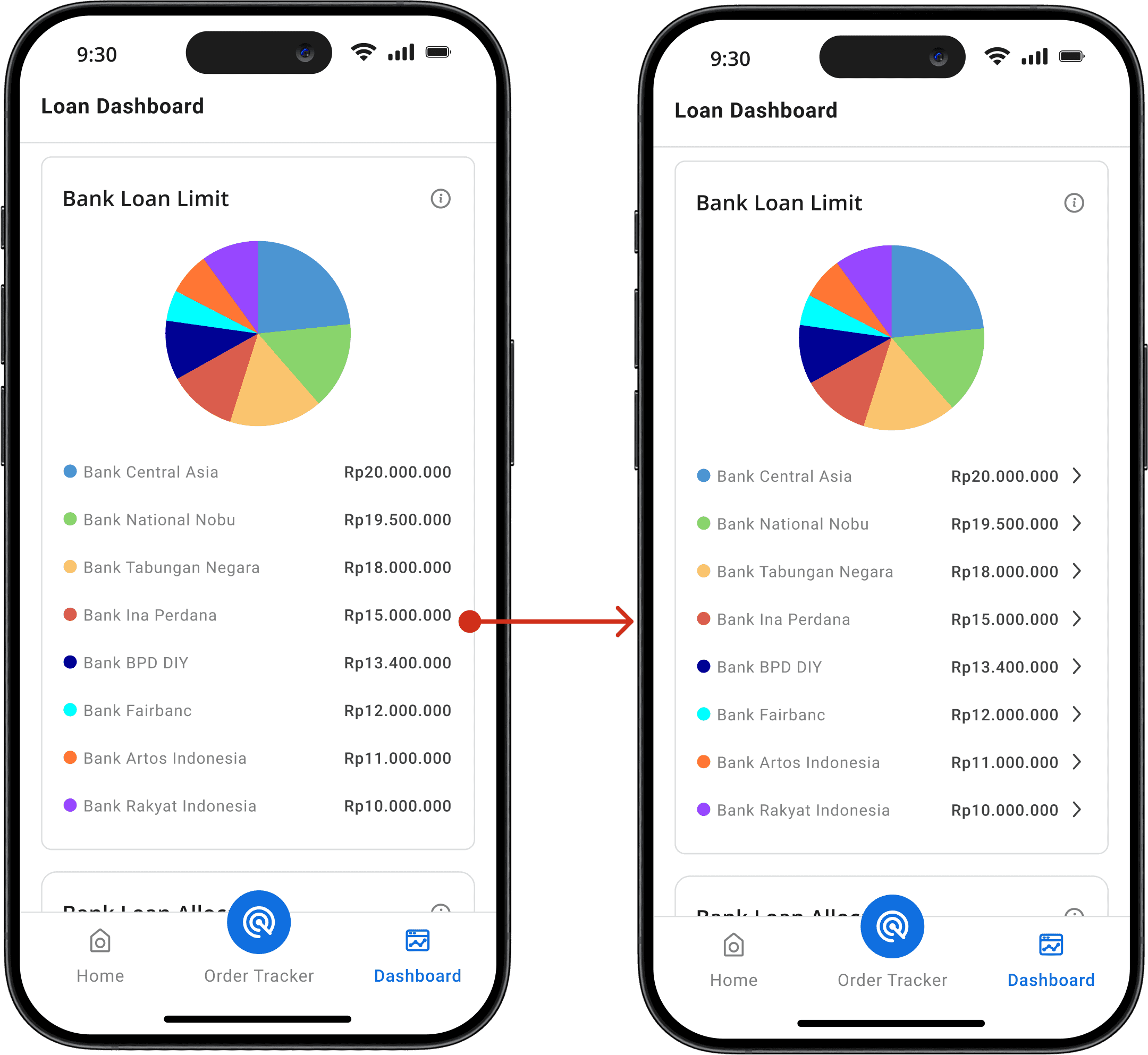
The Loan Dashboard provides users with a centralized view of their credit and loan details, enabling better financial management and decision-making. Designed for clarity and ease of use, it offers real-time insights into loan status, credit usage, and repayment progress.
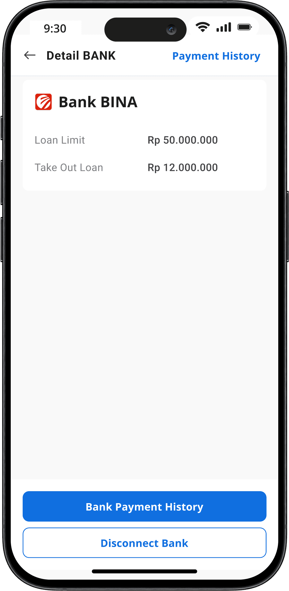
Bank Credit Transaction
The dashboard categorizes credit usage by different banks, providing a clear breakdown of expenditures across multiple accounts. This feature helps users optimize their credit distribution and manage repayments effectively.
Loan Limit
A dynamic display of the user's available credit limit, updating with every transaction to provide accurate financial visibility.
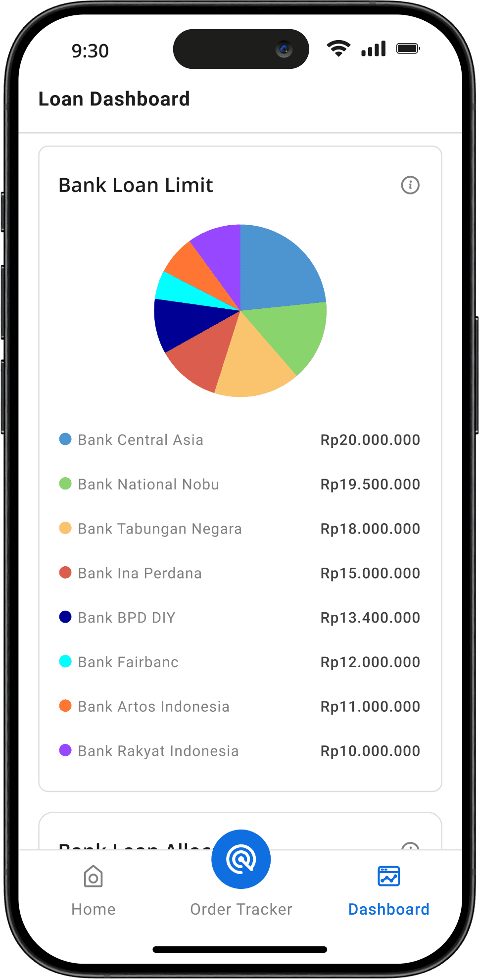
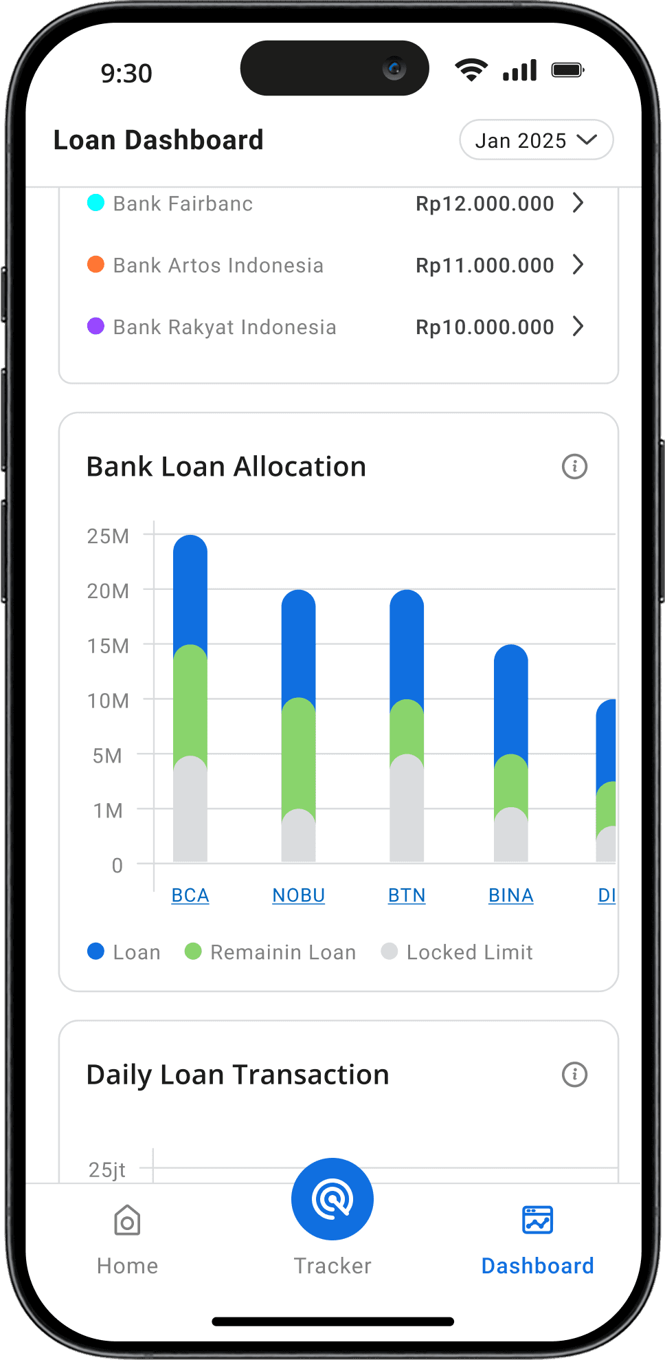
Loan Allocation
A detailed breakdown of how loans are allocated across different banks, ensuring users understand their outstanding balances and repayment structures.
Daily Credit Usage Tracking
Users can monitor their daily credit expenditures in real-time, helping them stay informed about their spending habits and make better financial decisions.
Iteration Point 1
Adding Chevron to Highlight Legend's Touchpoint
We found out from usability testing that user completely skipped the first version as they don't know the Bank list in the legends can be click to show the detail.
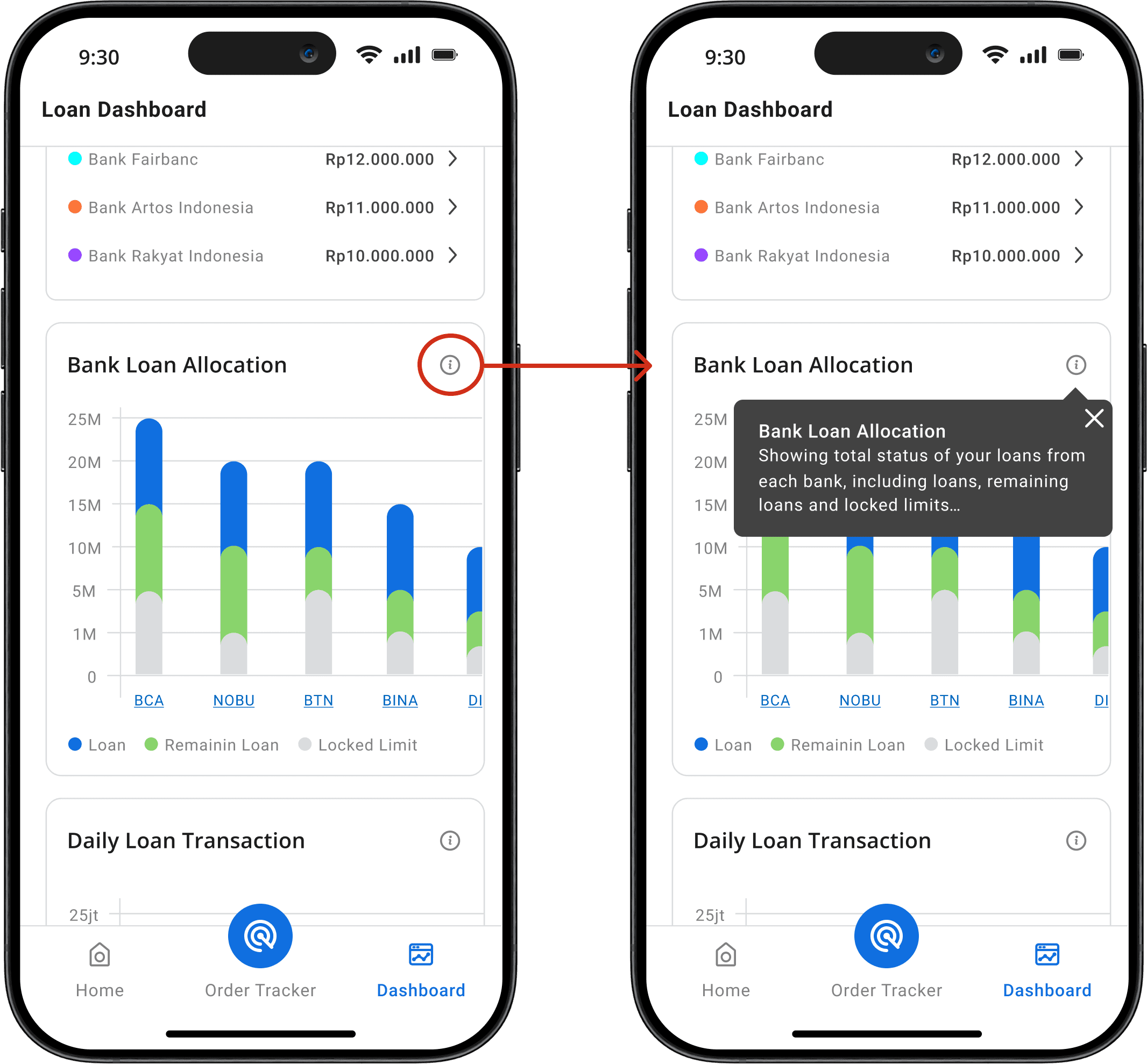
Iteration Point 2
Adding Tooltips on each section
Users feel unsure about the feature so they need some context
Lesson Learned
Key Takeaways
User prefer Predictability in Financial Interfaces
Money-related actions often trigger anxiety. By replacing inconsistent dropdown interactions with a bottom sheet, we reduced uncertainty, making users feel more in control and confident in navigating their accounts.
Constantly ask for feedback and iterate
From noticing mistakes in my UI to uncovering more foundational UX problems in my app, I’m thankful to have constantly asked for feedback from my peers and my mentor. In the end, I pushed to have the app as best I could, and did not let my own thinking stop me from questioning if my own decisions were truly best for the user.